After much discussion, we have decided to find a new layout for our website as we felt the previous one just wasn't working for us. Here is a preview of what we have done so far:
Above, is the real album cover for the Little Comets which is very processed, unrealistic looking with an almost creepy but cool look. It's very abstract in that we don't know what's going on which is the theme we want to go with. The font is very skinny, displaying a more quirky edge and the children represent the youth of the band: they're silly, they mess around. This, again, follows the indie image in that they don't follow the rules or take themselves too seriously. The location, possibly a run down derelict area, almost represents a more working class area which is what the indie bands also portray.
We have updated the digipak and added the back cover. To create this we started making a layered background on Photoshop and then painting the balloon over this. We added text in our chosen font: 'Ostrich Sans Rounded'. We then did the spine of the CD, we kept this simple by just putting on the name of the artist and album.
DEADLINE FOR COMPLETED DIGIPAK & WEBSITE IN NINE DAYS!!
Things that we still need to complete for the digipak are to create the back and front cover and inside sleeve of the CD. For the website we just need to add our own photographs of our representation of the band and decide which website design we want to go with so that we can finalise the information we want to add in to make it seem like an actual working band website. We plan to take these necessary photographs this coming weekend on the 16th December 2012, after this we foresee production of everything else will be completed faster and easier
We updated the previous digipak to this version in which we feel represents the band better and portrays a more hand drawn, rustic and abstract look. By using Photoshop and a Pen Tablet we were able to draw the layered background of blues and draw the balloon. The colours are purposely messy, emphasizing that home made, do it yourself, image. We then used a cross processing effect to give an abstract edge. We copied the Little Comets' font, which is skinny, for the cover and a handwritten look.
This is the first idea of our digipak that has been produced in photoshop. It is of a balloon leaving earth with a magnifying glass looking down on it. As you can see it is very homemade which is similar to the Little Comets' (our chosen band) style. It's also very over processed and unrealistic, showing the band are not too serious-keeping with the indie image, which also follows the band's original image.
For our digipak we are searching the perfect font to coincide with the images and the band as a font can say a lot. We want a modern, yet almost silly, font showing the band don't take themselves seriously but are still contemporary. There almost has to be an element of cool and rustic, for the indie image the band has, so a handwritten font would look most natural and down to earth.
After searching dafont.com here are our choices:
We have sketched an image of a balloon for our website as they tie in with the music video and digipak. We sketched them because we wanted to add some originality instead of just using google image.
Here is the final image with this sketch incorporated onto our website:
There's only 16 days until the deadline for the digipak and the website. We are currently finalizing our ideas about the digipak, to then make one as we changed our idea for our music video we had to completely scrap our previous plans. The website is almost finished, we just need to replace the pictures of the band Little Comets with our own interpretations.
After shooting the majority of the video on Sunday, we have decided to film the whole song in performance just incase we need to add some extra performance to the video. For this we're going to choose a really interesting location to contrast with the slightly normal location of a home. Here are some of our location ideas:
A hill
Wollaton Park
Graffiti places
A bridge
A forest
Train station
An alley way
Lee Rosy's tea cafe
College lift
We have decided to film in a more "interesting" place for our performance as indie bands often have at least one interesting, almost contrapuntal, location making their video quirky and interesting. Here are some examples:
The Vaccines-Teenage Icon
They use a lift to display uniqueness.
Neon Trees- Everybody Talks
They use a movie drive in, with them in a film, to show originality and add the humour factor.
We are making our own digipak so have done some essential research first on existing digipaks of the same genre of our chosen band, indie. We like this digipak because:
Running colour scheme-Red, blue and white runs throughout all of the sections
Lots of pictures of the bands-establishes who they are
Grunge style-quite dark and gloomy, fits with the indie image
Name of the album and artist-establishes who they are and makes the CD easily identifiable
No blank spine
Track listing-the consumer knows what the tracks are called and what they're getting on the CD
Company and record label logos
Good layout-not too crowded
Use the shape of the CD to their advantage e.g use the hole in the CD for an 'o', quite kooky and inventive
Lesley Kernochan-The Pickle Jar
Positives of the digipak:
The running theme of the jar across the digipak
The theme of the same colours: 'sunset' inspired, orange, yellow, red and purple
The b+w background and subject on the front allows the colourful jar to stand out, which ties in and emphasizes the name of the album 'the pickle jar
On the 25th of November, we had our first shoot for the video. We filmed all but two scenes because they have to be done in college, so most of it is complete. We filmed the full party scene, performance and most of the beginning.
Everything went incredibly well, we had a slow beginning as we organised everyone into position and explained thoroughly the narrative whilst preparing props and costumes-ensuring everything was in order. After this, it went very smoothly and everybody acted very professionally so we could get it done, not only on time, but so the outcome had a great finish and look.
We have learnt for future shoots that we should begin filming earlier as it got dark very quickly so certain outdoors scenes could not be done, or had to be done in miserable or dark weather. Luckily for us the majority of the video was filmed inside so this wasn't a major issue.
We have decided as a group to change the narrative of our music video because we realised that with the number of extras and cast needed there would be numerous issues with continuity which we could not risk to take. We also didn't think that the narrative suited the target audience as effectively as it could have so by making this decision we feel that the outcome will be significantly better.
Our New Idea:
A girl (the victim) is getting bullied in the corridor
Her shopping drops all over the floor
The band are loitering about on the street, they see her
They go to help her, victim runs in house
The band follow
They see her in the window and sing
Appear in the house and sing
Performance of first verse
Victim sat there miserable, ignores band
The band run to find people to cheer her up
Get one person from: the toilet, a bed and cupboard
They try to make her dance-it doesn't work
Dance around her
Offer her: money, a puppy and a trifle
She still isn't happy
Offer her a boy, she is happy
They all dance together
They all dance out of the house
We feel this new idea is much simpler yet more effective as it adds more humour and emphasizes a party scene more-appealing to the target audience of teenagers. We also include alcohol, dancing and romance which again re-emphasizes this.
Performance Role: Bully victim and main protagonist in story-line
Make-up/Hairstyle: Natural looking make-up no excessive amounts. Simple neutral look. Hair is...nice ? lol. Style/Colours/Intended Image: We wanted a normal typically girly appearance so brightly pink/red jumper and long flowy hair and simplistic jewellery. Influences on Image/Similar Styles:
Zooey Deschanel - New Girl (American Television Sitcom) - also we're introducing intertexuality as our protagonist is female and is the victim which is also true for Deschanel as the men usually have to come and help her out. Also Zooey is very feminine and girly precisely like how we want to portray our actress
Carly Rae Jepsen - pop/electronic vibe which is appropriate for the theme of our song as well in a way
An example of how a girl can saved by the band can be seen in the Noah and the Whale music video for Shape Of My Heart, this portrays the girl as being the vulnerable one and needs the men in the bands assistance to be back in a normal situation once more.
Make-up/Hairstyle: Typical indie/fashionable facial hair and lip piercing, floaty hair swept to the side. No make-up. Style/Colours/Intended Image: No brightly coloured clothing which relates to the indie stereotype of dress; casual but cool and laid back. Influences On Image/Similar Styles:
To promote our band properly we are in the process of making two websites to get more experience with the website builder (wix.com) and to see which website works best for the band we have chosen in order to create a more effective website.
Location: Marehay, Derbyshire The location is a public footpath near my house. The footpath leads on to some very open fields, and hills. We would be hoping to film scene in which the band are carrying equipment here. In the day time we would need no added lighting, and as the footpath is quite a way from the main road, we would have no sound issues, such as the actors hearing the track. Safety hazards could include natural things such as nettles, and slippery surfaces such as mud. No permission is required for use of this site.
Costume/Makeup: Panda costume, red nose, glasses. Trying to look silly and humorous.
The make-over sections of the video are intended to add humour, and not let the video become too serious. It's a fun song and a lot of indie acts don't mind not taking themselves completely seriously.
CD Cover/Album analysis of my chosen artist and 3 similar artists:
My chosen artist:
Artist-Jake Bugg
Title-Self titled
Track List: Lightning Bolt, Two Fingers, Taste It, Seen It All, Simple as This, Country Song, Broken, Trouble Town, Ballad of Mr. Jones, Slide, Someone Told Me, Note to Self, Someplace, Fire
Institutional logos: None visible
Appropriate iconography: Artist on the front cover for instant recognition of whose album it is and establishes who the artist is for those who are unfamiliar, the name of the album to show what it is.
Similar artist 1:
Artist- Noah and the Whale
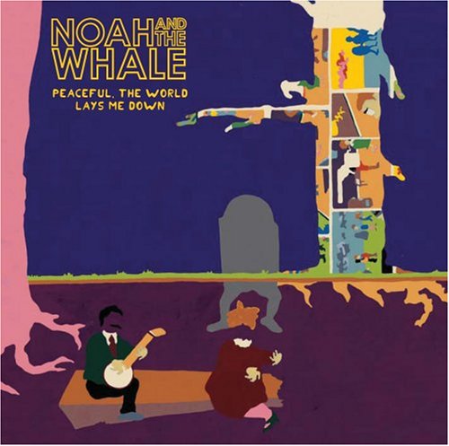
Title- Peaceful, The World Lays Me Down
Track List- 2 Atoms in a Molecule, Jocasta, Shape Of My Heart, Do What You Do, Give A Little Love, Second Lover, 5 Years Time, Rocks And Daggers, Peaceful The World Lays Me Down, Mary, Hold My Hand As I'm Lowered
Institutional logos- Young And Lost Club, Vertigo
Appropriate iconography- The logo of the band which tells us who the CD is by so we can easily recognise it in the store, artwork on the cover to go alongside the songs and be part of a theme which runs through the booklet inside the CD also, institutional logos to show who their record company is and a sticker on the front cover of reviews e.g "Romantic folk with an epic scope NME" (on the hard copy i own)
Similar artist 2:
Artist- Mumford & Sons
Title- Sigh No More
Track List- Sigh No More, The Cave, Winter Winds, Roll Away Your Stone, White Blank Page, I Gave You All, Little Lion Man, Timshel, Thistle & Weeds, Awake My Soul, Dust Bowl Dance, After The Storm
Institutional logos- Island 50, Island, Gentlemen of the Road
Appropriate iconography- The album title and band name so you know who it's by and what it's called, a picture of the band so you can easily recognise the CD and also know who it's by if you're a first time listener, institutional logos to know who produced it and who the record label are, reviews on the front cover e.g "Genuinely splendid- The Observer" (on the hard copy)
Similar Artist 3:
Artist- The Vaccines
Title- What Did You Expect From The Vaccines?
Track List-Wreckin' Bar (Ra Ra Ra), If You Wanna, A Lack Of Understanding, Blow It Up, Wetsuit, Norgaard, Post Break-up Sex, Under Your Thumb, All In White, Wolf Pack, Family Friend
Institutional logos-Columbia (x2), Stereo
Appropriate iconography- Clearly shown who the album is by, there is a picture on the front cover to go alongside the tracks however this one is unsual as it is not of the band, the album title- this, however, is on the back of the CD which is, again, unusual as it makes it harder to find out what the album's called or for it to be easily recognised in store, institutional logos for record company/producer recognition.
I decided to photograph my brother as a potential performer because he listens to a lot of indie music- i would preferably like to do an indie music video, and follows the typical style associated with this genre of music e.g skinny jeans and polo tops so he knows a lot about the conventions of indie and understands what those videos are like. In addition, he is not camera shy, so if he was to be in the video he would not look uncomfortable but more proffessional. With him being in the target audience age range for indie music of 16 to 25, listeners would find him more relatable, making the video more effective and targeting the listeners correctly.
2. Locations
I decided to photograph my friend's living room as a possible location because it's quite open plan and would make a good space for quite a lot of narrative music videos, particulary a party scene or gathering. Also, if i was to choose the indie genre, it would fit in with the image of indie as being working class and down to earth because this isn't a flashy, state-of-the-art home but just a normal house on a council estate. It also adds a more realistic touch the music video that listeners are similar to the band, they too just live in normal homes, again re-enforcing that working class image. Therefore, it would really align with this image well and be relatable to viewers and listeners.
This is the draft of our website for Little Comets, we have incorporated the balloon theme again from the digipak to keep it coherent. As most browsers have rectangular windows rather than square we have resized the web-page accordingly.
We have made a rough, mock up of a digipak for our chosen artist: Little Comets. We have gone for the theme of balloons because in our music video we have done a party scene, featuring balloons, so we have created a strong link between the media texts in which capture the audience and instantly make them think of the band when they see this imagery and can recognise the album cover having only watched the video.
After researching Jake Bugg's existing album cover, i decided to make my own version of this using some of his ideas and incorporating them with the indie/folk working class attitude and image by adding a cigarette and a beer can. This, however, is not supposed to be a negative connotation but one of which represents his rebellious youth and down to earth nature.
We have done an audience demographic analysis report to see who the appropriate audience would be for our music video. It is crucial to find out the target audience for any media text in order to produce an effective product. This information will allow us to connect with our target audience significantly better. Therefor creating a more efficient music video.
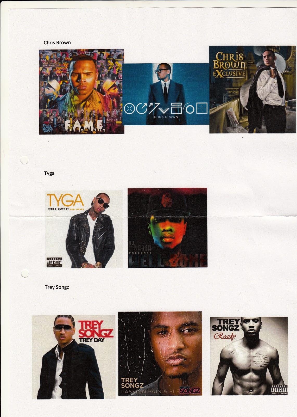
For the first activity, we were asked to analyse the CD covers and album for the chosen artist, in my case it is Chris Brown and other similar artists; Trey Songz and Tyga. Afterwards I was to create and sketch my ideas for my own CD cover for Chris Brown using ideas found from the research conducted.
The task was to choose an artist or band to conduct some research on. I chose to do Chris Brown an R&B artist. I then watched a series of his music videos and analysed them.


.jpg)
.jpg)
.jpg)